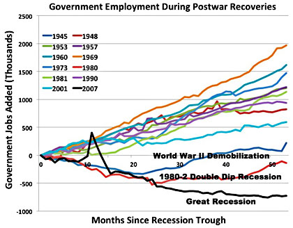
Great info graphic from Mother Jones. Kevin Drums writes…
Nobody asked me for my favorite chart of the year, which is too bad. Because I actually have one. It’s the chart from my austerity piece a couple of months ago that shows how government spending has plummeted during the current recovery, something that’s never happened before. If you want to understand the weakness of our economic recovery over the past five years, it tells about 90 percent of the story. But there are […]